  Page is Up,
Kastellyn Page is Up,
Kastellyn ,
26-Dec-07 02:02 PM, #14 ,
26-Dec-07 02:02 PM, #14
 I am working on...,
Mekantos,
26-Dec-07 03:19 PM, #15 I am working on...,
Mekantos,
26-Dec-07 03:19 PM, #15
RE: Page is Up,
HammerSong,
26-Dec-07 03:38 PM, #16
 RE: Page is Up,
HammerSong,
26-Dec-07 03:44 PM, #17 RE: Page is Up,
HammerSong,
26-Dec-07 03:44 PM, #17
RE: Page is Up,
Amberion,
26-Dec-07 05:52 PM, #18
Comments,
DurNominator,
27-Dec-07 05:54 AM, #19
RE: Page is Up,
Tahren,
02-Jan-08 11:22 AM, #20
RE: Page is Up,
Splntrd,
06-Feb-08 05:22 PM, #21
constructive (hopefully) critique,
Tahren,
19-Dec-07 04:56 PM, #9
oooooooh good one,
Stunna,
19-Dec-07 05:16 PM, #11
I think this is also a market/area thing,
elmeri_,
19-Dec-07 06:52 PM, #13
My IMHO,
Dervish,
19-Dec-07 04:16 PM, #7
RE: My IMHO,
Stunna,
19-Dec-07 04:51 PM, #8
RE: My IMHO,
Dervish,
19-Dec-07 05:13 PM, #10
Heh....,
Tac,
19-Dec-07 05:29 PM, #12
It gives me the error when I am trying to open the file...,
Dervish,
19-Dec-07 03:17 PM, #5
That's because it is really a Word doc and not a zip fi...,
nebel,
19-Dec-07 03:41 PM, #6
RE: welcom page revisions,
Kastellyn,
19-Dec-07 12:58 PM, #2
RE: welcom page revisions,
Daevryn,
19-Dec-07 01:39 PM, #3
RE: welcom page revisions,
Stunna,
19-Dec-07 02:01 PM, #4
I = R-tard . Attachment here.,
Stunna,
19-Dec-07 11:29 AM, #1
| |
| |
|
Mekantos | Wed 26-Dec-07 03:19 PM |
Member since 06th Dec 2003
796 posts
|   |
|
#372, "I am working on..."
In response to Reply #14
|
...A series of art pieces to use with the site, Kasty.
1) An alternate logo & header.
2) A custom, cool-looking layout for a Class page (probably starting with AP's or Necromancers since I feel inspired to do so).
3) I also intend to take one of the front-page stories and create some pictures for it...like a comic-book form. I hope that will be well-received.
Just giving you a heads-up on what you will be getting in your email soon.
Related note: Check out www.wowbb.com for a glimpse at some cool-looking forum software that, from what I can see, is not too pricey and may allow for the flexibility you all desire. I'm an amateur on the subject, but it certainly looks reasonable to me...
|
|
|
|
| |
|
DurNominator | Thu 27-Dec-07 05:54 AM |
Member since 08th Nov 2004
2018 posts
|  |
|
#377, "Comments"
In response to Reply #14
|
-I'll focus on the underlined text, since you seem to take an approach of read at least that:
totally replace all of your video games, all of your MMPORGs, all of your old D&D books (yeah, I know you still have them!) and even your Magic cards?
What totally replace all my..? Start from the beginning. a gaming experience that would totally.. So, a gaming experience should be underlined too.
you can experience it all for FREE, at no risk or obligation to you. You will never, EVER give us a credit card, and no money will EVER exchange hands.
No money will ever exchange hands? What's that donations button in the sidebar again? The statement is a lie and you know it. The game does accept money in the form of donations and there are people who do donate to the game. That's money changing hands. You'll need to change the wording to be truthful so that people can trust what you say. Otherwise they'll think it is all lies. Honest truth is our best selling card here, as there's plenty of Free* and Free(1) games out there who market with lies or by omitting the uncomfortable parts.
-The love of white space. Put line breaks between the items in the list. The underlining of the beginning was a good thought, but the line breaks will help to see the text blocks separately so that people will bother to read them.
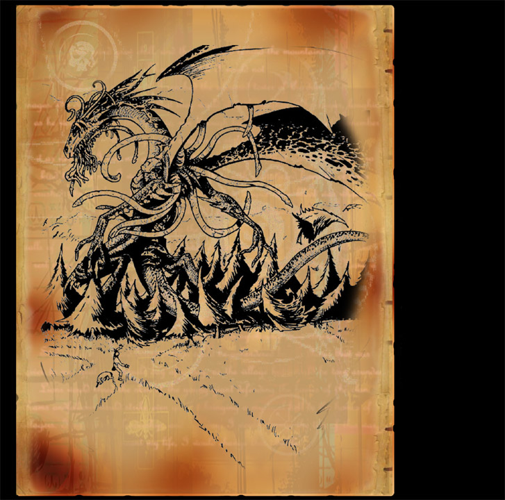
-The game may be text-based, but you need artwork to give that imagination something to start on in visualizing the world and getting people interested in it. Immortals, landscape, etc. The welcome page needs to have at least one picture of artwork illustrating Thera.
|
|
|
|
| |
|
Tahren | Wed 02-Jan-08 11:22 AM |
Member since 25th Oct 2003
70 posts
|  |
|
#383, "RE: Page is Up"
In response to Reply #14
|
I won't rehash my comments on this style. I will say that the format is very difficult for me to read.
First line should maybe be broken into two lines - the red "discover" line, and below it the "and you'll know" line. It's readable as-is, but looks somehow sloppy/incomplete.
Top five reasons block is really tough to read. Maybe put a carriage return after each bullet to break it up some.
When I opened the page for the first time, those were the main eyesores.
Aside: Frequently changing font style, size, color, etc may help to highlight important points. But if every other line is different from the line before it, then everything (or nothing) is highlighted as important. It ends up reading like those MUDs where everything is a different color, and it looks like a rainbow threw up on the monitor. Finding the right mix of highlight vs. boring should be a priority for this style. It might be as simple as choosing one or two "highlight" types - for instance, use +1 size red bold for major highlights and regular size underline bold for minor highlights....or something.
Another quirk that I can't figure out how to fix: page width. As I expand/contract the window, I can get a completely different page effect because text line wrap width is adjustable. At the same time, I really don't advise fixing the text or window width because of how irritating that can be on other websites. You have a min width set...maybe try with a max width too and see how that works out?
|
|
|
|
| |
|
Splntrd | Wed 06-Feb-08 05:22 PM |
Member since 08th Feb 2004
1096 posts
| |
|
#384, "RE: Page is Up"
In response to Reply #14
|
Looking at it right now..
it reads like an #### enlargement ad. Splntrd
|
|
|
|
|
|
Tahren | Wed 19-Dec-07 04:56 PM |
Member since 25th Oct 2003
70 posts
| |
|
#366, "constructive (hopefully) critique"
In response to Reply #0
|
I just wanted to toss my two cents in. Your welcome letter has a good conversational tone, and does a good job of staying lighthearted, casual, and positive. You earn credibility through "full disclosure", and the specific topics flow allright (a few revisions would help, but as you said it's an unproofed draft).
That said, it reads to me like a spam email. I'm not sure why that is, but the end effect is that I (as you put it) hit the button on the remote.
I'll try to be (briefly) constructively critical in the interest of improving this style of welcome page:
"I promise you won't regret it" doesn't fly with me. My analytical mind says that's an empty promise (how can you promise how I will feel?), so anything else you say may be just as empty.
"Literally takes your breath away" - probably just a pet peeve of mine with the overuse of the word literally that drops my attention level.
"You know you would" invokes a feeling of being pressured to me. Try it, you'll like it. You know you will. Here. Do it.
"Thousands of gamers...hopelessly addicted", but if I do log in for the first time and find there's only 50 people online? I know what you mean, but would a first-time reader understand?
"FREE FREE FREE" I get it, you're free. But everyone else who wants my money is "FREE FREE FREE" too (this complaint holds true for the other marketing efforts as well, including the other revisions of the welcome page - just an observation).
But see, this is the difficulty in marketing. I may be the 1% of people that reacts this way, whereas another 99% of new readers may react extremely positively. To me, this would make a good one-page testimonial. As a testimonial, I naturally discount the pet peeves above, and pick up on the major items that interest me - including the drawbacks of the game. In fact, I tried to gear my mind toward "this is a testimonial" the fourth time I read it, and I picked up on things that I hadn't seen the first three read-throughs (like marriages).
Take this all as constructive criticism. You tossed it in the ring for us to kick around, and I gladly obliged... because kick is overpowered.
Now...you know...what if you stick this on a parchment-style background (or, better yet, a jpg scan of a really distressed/burned/crumpled -actual- letter)...reduce it to one-page and clean it up some...LINK to it on the welcome page (use a couple-inches tall icon that looks like the parchment document itself)....put "Letter from a Recovering CF Addict" below as part of the link... Maybe rewrite it in the form of convincing me NOT to play the game because of it's dangerously addictive qualities.. Then you create a little gimmick, a little whimsy...and I can stop putting elipses between every thought...hmm...
|
|
|
|
| |
|
elmeri_ | Wed 19-Dec-07 06:52 PM |
Member since 13th Dec 2004
252 posts
| |
|
#370, "I think this is also a market/area thing"
In response to Reply #11
|
In Finland, marketing is rarely agressive. People get very easily bothered if they feel like something is too personal or invades their personal space. I will personally discard anything that even looks like an add (unless it's one of those really funny tv ones). I will never click on a sponsored google link, because I am sure it's the devil, and they are only out to get me.
But eh, it's probably not a good idea to try and put a lot of effort into this kind of sales promotion towards my kind of people.
|
|
|
|
|
|
Dervish | Wed 19-Dec-07 04:16 PM |
Member since 11th Oct 2003
617 posts
|
 |
|
#364, "My IMHO"
In response to Reply #0
|
1. That intro, it smells like typical american selling letter. Quite agressive, I would say. Ask players what they think about it? Its good but quite agressive and in Russia people dont like such style because its looks like "agressive advertising". But in USA many use it, so I wont say it is not working. Ask opinions of others?
2. You mentioned flaws - certainly good idea. Maybe elaborate this a bit more? Like "Secondly, it may surprise you that the whole game is text based. While at first this seems out of place in our world of hyperplasmagraphix, I think it’s actually one of our greatest assets. CF is a place where you’re imagination determines what you “see.”"
and add that after several hours of playing you will feel more or less comfortable with it and after few weeks you wont notice this at all. Your imagination will do the work, and trust me, it will do it not worse than any graphic.
And add some more here "Probably the biggest downfall of new players is that there IS a learning curve. ".
Many different fonts and colors make it annoying to read. Final copy should be more...hm, calm (if this is permittable word). Use bold and heading to emphasize some words, that should be enough
Good copy, I like it, just doubt a bit about this agressive "I am your friend" style.
|
|
|
|
| |
|
Stunna | Wed 19-Dec-07 04:51 PM |
Member since 04th Mar 2003
1048 posts
|  |
|
#365, "RE: My IMHO"
In response to Reply #7
|
>1. That intro, it smells like typical american selling
>letter. Quite agressive, I would say. Ask players what they
>think about it? Its good but quite agressive and in Russia
>people dont like such style because its looks like "agressive
>advertising". But in USA many use it, so I wont say it is not
>working. Ask opinions of others?
It works very well.
>
>2. You mentioned flaws - certainly good idea. Maybe elaborate
>this a bit more? Like "Secondly, it may surprise you that the
>whole game is text based. While at first this seems out of
>place in our world of hyperplasmagraphix, I think it’s
>actually one of our greatest assets. CF is a place where
>you’re imagination determines what you “see.”"
>and add that after several hours of playing you will feel more
>or less comfortable with it and after few weeks you wont
>notice this at all. Your imagination will do the work, and
>trust me, it will do it not worse than any graphic.
I see where your going with this. I'll take all this kind of suggestion and do a tweak session after they pile up.
>Many different fonts and colors make it annoying to read.
>Final copy should be more...hm, calm (if this is permittable
>word). Use bold and heading to emphasize some words, that
>should be enough
Here I have to flat out disagree. This format is designed so that every word can be read, only bullets can be read, only highlighted sections can be read... so that if someone just skims it they will skim to the important selling points.
It also breaks up the copy so that it's chunked down for people to read. It's kind of like how it might be hard for an out of shape guy to run a mile on a track, but not if you run next to him and keep telling him to get to the end of the block.
P.S You'll be hard pressed to give me copy writing lessons. I have spent at least $40,000 in multiple training courses on it. I have a swipe file of over 200 letters and 500 different ads that I have meticulously collected over the last 3 years. I was recently invited to guest speak at K. Hafner's marketing bootcamp as a copy writer. AND I have personally made over 1/2 a million dollars off my sales letters in the last 3 years.
As a matter of fact, I'll attach my 16 page letter for my school that has a running 32% response rate. THIRTY TWO percent. Do you realize how insanely high that is?! Muahahahaa.
(make sure you open as word document)  Attachment
#1, (txt file) Attachment
#1, (txt file)
|
|
|
|
| |
|
Tac | Wed 19-Dec-07 05:29 PM |
Member since 15th Nov 2005
2050 posts
| |
|
#369, "Heh...."
In response to Reply #8
|
I get that this stuff works intellectually, but I don't understand why. The question I think we need to ask is, is our target demographic more like Tahren and I, in that this stuff reads like spam email, or are we looking for a broader audience that it would appeal to. I don't doubt your talent, or your success, but I do (somewhat) question whether the demographic who is looking to takes their kids to taekwondo and the demographic that is looking for the sort of soul sucking hobby that is CF might respond differently to different sorts of advertisements. Just something to think about, and to be fair, I like the CF one quite a bit, but this one made me want to puke a little 
Please don't let me discourage you from helping, but I did want to add my input specifically re: the demographic
|
|
|
|
|
|
Dervish | Wed 19-Dec-07 03:17 PM |
Member since 11th Oct 2003
617 posts
|
|
|
#362, "It gives me the error when I am trying to open the file..."
In response to Reply #0
|
|
|
| |
|
nebel | Wed 19-Dec-07 03:41 PM |
Member since 03rd Oct 2003
148 posts
| |
|
#363, "That's because it is really a Word doc and not a zip fi..."
In response to Reply #5
|
|
|
| |
|
Daevryn | Wed 19-Dec-07 01:37 PM |
Member since 13th Feb 2007
11117 posts
| |
|
#360, "RE: welcom page revisions"
In response to Reply #2
Edited on Wed 19-Dec-07 01:39 PM
|
>I think it requires more knowledge of .php than
>I have (currently, I don't even know what .php is or what it
>stands for).
What PHP stands for is dumb as only socially inept nerdery can be. Moving on...
You pretty much can treat the web page's .php files as .html files. Pretend the stuff in <?php?> tags are html tags you don't understand and possibly shouldn't mess with, and you're there -- if you can manage style sheets or normal html markup for style you're probably good to go.
Edited to add more detail as follows: PHP basically is one of many technologies that allows people to create dynamic web pages. The way the home page swaps in a different intro story randomly is one simple example of using PHP for dynamic content.
|
|
|
|
| |
|
Stunna | Wed 19-Dec-07 02:01 PM |
Member since 04th Mar 2003
1048 posts
| |
|
#361, "RE: welcom page revisions"
In response to Reply #2
|
>1. It's about time! 
Between work, the holidays and trying to play my mort enough to be a leader it's been tough. Sowwies.
>2. What do you mean add features/benefits? To your Top Five?
Yea... I think there is more to be said about why CF is teh awesome. A top five could be 7, 8, 9 or even 27. People will read enough to excite them and move on, so the more the merrier.
>
>3. Why on white? Easier to read? Stands out more? Because
>red looks better? The reason I ask is because I'm not sure I
>can do this - I think it requires more knowledge of .php than
>I have (currently, I don't even know what .php is or what it
>stands for). Would it kill us to take the easy way out and
>leave it on the current black background?
Easier to read is right, but not exactly right. The enemy of any advertisement is difficulty to read and understand. Any difficulty in following the ad will result in a disconnect you'll never recover from. Picture a guy watching commercials - he's got his remote in hand waiting for an instant of boredom. His show runs straight into a Bud Light commercial, and he watches it because beer commercials are funny. Next one is a commercial for gov't issued coins, of which he is an avid collector - he watches, commercial three is Geico and hilarity ensues, commercial four they start talking about tampons and *CLICK* he's gone. At the first disconnect for him in the advertising he tuned out.
Same thing happens with a sales letter. Difficulty factors pile up one on one... maybe the letter is written in verbiage that's difficult for the prospect, then on top of that the little tidbits meant to be funny and interesting don't do it for him, and then the background color and text is hard to read ---- and then and then and then ----- There can be dozens of little things that on their own don't make him tune out, but when stacked together will. The thing you have to do with a sales letter is eliminate as many of those little things as possible.
ALSO advertising should always be visually interesting. The more eye-popping the more readership. Contrast is very important.
Lastly, it's what people are most accustomed to. This might be the best reason...
>
>4. I'll get this up tonight after work.
I didn't proofread it, because I don't proofread my own stuff. This is a first draft, kinda figured we'd kick it around a bit. But that's okay, put it up and we'll kick it around and tweak it later. Money loves speed!
Throw #### against the wall and see what sticks, wipe the rest up on it's way down. Marketing words to live by.
>
>Thanks! I like this a lot; I think it does a better job of
>grabbing a new player from a variety of different verticals,
>so we can have just one "welcome" page.
No prob. Once that is up I'll take a look at improving PPC and banners... then all we have to do is make list of website to put them on.
>
>Kastellyn the Devourer of Magic, Lord of Legends
>
>*** Email me your testimonials or two-line blurbs. Help our
>marketing efforts! ***
|
|
|
|
|
|
Stunna | Wed 19-Dec-07 11:29 AM |
Member since 04th Mar 2003
1048 posts
| |
|
#358, "I = R-tard . Attachment here."
In response to Reply #0
|
|
|
|


 LOVE IT!